Cumulative Layout Shift (CLS): Stop losing customers to jumpy layouts
Your user goes to tap "Buy Now" but a banner loads late and pushes the button down. They accidentally hit "Cancel" instead. This happens 800 times a day on your site. You're bleeding revenue to layout shifts.
What is CLS (and why it kills conversions)?
CLS measures how much your page content jumps around while loading. Every time an image loads late, a banner pops in, or web fonts swap and the page layout shifts, users lose trust.
What happens: User starts reading your product description. An image finally loads and shoves all the text down 300 pixels. They've lost their place. They're frustrated. They leave.
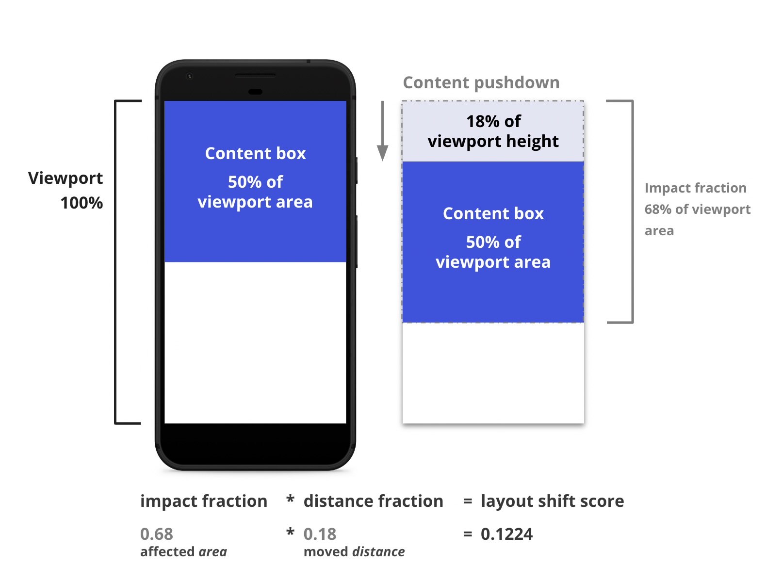
The CLS score combines how much of the screen was affected (impact fraction) and how far content moved (distance fraction). Higher score = more frustrating experience.
CLS thresholds
Important: User-initiated shifts (clicking a button that shows content) don't count. Only unexpected shifts that happen during loading or while the user is trying to interact are measured.
Why CLS matters for user experience
Layout shifts cause real problems. Users tap the wrong button when content moves. They lose their reading position when text jumps. They abandon forms when input fields shift during typing.
Accidental clicks
User goes to tap "Submit" but an ad loads and pushes the button down. They accidentally tap "Cancel" instead. Happens thousands of times per day on high-traffic sites.
Lost reading position
User is reading an article. An image loads late and pushes the text down. They've lost their place and have to scroll back up to find where they were.
Form frustration
User starts typing in a form. A cookie banner loads and shifts everything down. They're now typing into a different field without realising.
Research shows that sites with poor CLS see 25% lower engagement and 15% higher bounce rates. Visual instability erodes trust instantly.
How to measure CLS
Field data (Real users)
CLS varies dramatically between users. Someone on fast internet sees content load quickly with minimal shifts. Someone on slow 3G sees late-loading content causing major shifts.
- Iron/Out free benchmark - Get your CLS from Chrome UX Report
- Google Search Console - Core Web Vitals report shows CLS by page group
- Real User Monitoring - Track CLS for every visitor with our observability implementation
Lab data (Testing)
Lab tools show potential CLS but miss real-world scenarios:
- PageSpeed Insights - Simulates mobile device with throttled connection
- Lighthouse - Built into Chrome DevTools, provides CLS score and highlights shifting elements
- WebPageTest - Visual filmstrip shows exactly when shifts occur
Debug CLS visually
// Chrome DevTools Performance tab
// 1. Open DevTools > Performance
// 2. Start recording and reload the page
// 3. Look for "Layout Shifts" in the Experience track
// 4. Click on a shift to see which elements moved
Measure CLS programmatically
Install the web-vitals library:
npm install web-vitalsThen track CLS:
import {onCLS} from 'web-vitals';

onCLS((metric) => {
  console.log('CLS:', metric.value);

  // Get details about each shift
  metric.entries.forEach(entry => {
    console.log('Layout shift:', {
      value: entry.value,
      startTime: entry.startTime,
      // Elements that shifted
      sources: entry.sources?.map(source => ({
        node: source.node,
        previousRect: source.previousRect,
        currentRect: source.currentRect
      }))
    });
  });
});
Common causes of CLS
1. Images without dimensions
When images load, the browser doesn't know how tall they are. It reserves 0px height, then shifts the layout when the image loads.
Fix: Always specify width and height attributes on images.
2. Ads without reserved space
Ad networks load dynamically. If you don't reserve space for the ad, content shifts down when it loads. This is the #1 cause of poor CLS on content sites.
Fix: Reserve fixed-size containers for ads with min-height.
3. Web fonts causing text reflow
Fonts load late. The browser shows fallback text, then swaps to the real font. If the fonts have different metrics, text reflows and shifts layout.
Fix: Use font-display: optional or size-adjust to match fallback fonts.
4. Dynamically injected content
Banners, notifications, cookie consent dialogs that push content down when they appear. Users start reading, then everything jumps.
Fix: Load critical UI elements during initial render, or overlay them instead of pushing content.
5. Animations triggering layout
Animating properties like width, height, top, left forces layout recalculation and can cause shifts in surrounding content.
Fix: Use transform and opacity for animations (these don't trigger layout).
CLS optimisation techniques
1. Always specify image dimensions
Set width and height attributes
<!-- Bad: No dimensions specified -->
<img src="hero.jpg" alt="Hero">

<!-- Good: Explicit dimensions -->
<img
  src="hero.jpg"
  alt="Hero"
  width="1200"
  height="600"
/>

<!-- Modern browsers calculate aspect ratio automatically:
     aspect-ratio = 1200 / 600 = 2
     The image will scale responsively while maintaining space -->
Use aspect-ratio CSS for responsive images
<!-- For images with srcset/sizes -->
<img
  srcset="hero-400.jpg 400w,
          hero-800.jpg 800w,
          hero-1200.jpg 1200w"
  sizes="(max-width: 768px) 100vw, 1200px"
  src="hero-1200.jpg"
  alt="Hero"
  width="1200"
  height="600"
  style="width: 100%; height: auto;"
/>

/* CSS solution for unknown dimensions */
.image-container {
  aspect-ratio: 16 / 9;
  width: 100%;
  overflow: hidden;
}

.image-container img {
  width: 100%;
  height: 100%;
  object-fit: cover;
}
Impact: Eliminates image-related CLS entirely (can reduce CLS by 0.1-0.3)
2. Reserve space for ads and embeds
Fixed-size ad containers
<!-- Reserve space for ad before it loads -->
<div class="ad-container">
  <div id="ad-slot"></div>
</div>

<style>
.ad-container {
  min-height: 250px; /* Standard ad height */
  width: 100%;
  background: #f3f4f6; /* Placeholder color */
  display: flex;
  align-items: center;
  justify-content: center;
}

.ad-container::before {
  content: 'Advertisement';
  color: #9ca3af;
  font-size: 0.75rem;
  text-transform: uppercase;
}
</style>
Reserve space for embeds
<!-- YouTube embed with aspect ratio -->
<div class="video-container">
  <iframe
    src="https://www.youtube.com/embed/dQw4w9WgXcQ"
    title="Video"
    frameborder="0"
    allow="accelerometer; autoplay; encrypted-media; gyroscope"
    allowfullscreen
  ></iframe>
</div>

<style>
.video-container {
  position: relative;
  padding-bottom: 56.25%; /* 16:9 aspect ratio */
  height: 0;
  overflow: hidden;
}

.video-container iframe {
  position: absolute;
  top: 0;
  left: 0;
  width: 100%;
  height: 100%;
}
</style>
3. Optimise web font loading
Match fallback font metrics
/* Use size-adjust to match fallback font to web font */
@font-face {
  font-family: 'Roboto';
  src: url('/fonts/roboto.woff2') format('woff2');
  font-display: swap;
}

@font-face {
  font-family: 'Roboto Fallback';
  src: local('Arial');
  /* Adjust fallback to match Roboto's metrics */
  size-adjust: 95.7%;
  ascent-override: 92%;
  descent-override: 24%;
  line-gap-override: 0%;
}

body {
  font-family: 'Roboto', 'Roboto Fallback', Arial, sans-serif;
}

/* Or use font-display: optional to prevent swap entirely */
@font-face {
  font-family: 'Roboto';
  src: url('/fonts/roboto.woff2') format('woff2');
  font-display: optional; /* Only use if loaded in ~100ms */
}
Tool: Use Fallback Font Generator to calculate size-adjust values
4. Avoid inserting content above existing content
Use fixed/sticky positioning for banners
/* Bad: Pushes content down */
.cookie-banner {
  position: relative;
  width: 100%;
  background: #1a1a1a;
  color: white;
  padding: 1rem;
}

/* Good: Overlays content */
.cookie-banner {
  position: fixed;
  bottom: 0;
  left: 0;
  right: 0;
  background: #1a1a1a;
  color: white;
  padding: 1rem;
  z-index: 1000;
  /* No layout shift */
}

/* Better: Reserve space in advance if banner is critical */
body {
  padding-bottom: 80px; /* Height of banner */
}

.cookie-banner {
  position: fixed;
  bottom: 0;
  left: 0;
  right: 0;
  height: 80px;
}
5. Avoid animations that trigger layout
/* Bad: These trigger layout recalculation */
.box {
  transition: width 0.3s, height 0.3s, top 0.3s, left 0.3s;
}

/* Good: These are GPU-accelerated and don't affect layout */
.box {
  transition: transform 0.3s, opacity 0.3s;
}

/* Example: Slide-in animation */
/* Bad */
@keyframes slideIn {
  from { left: -300px; }
  to { left: 0; }
}

/* Good */
@keyframes slideIn {
  from { transform: translateX(-300px); }
  to { transform: translateX(0); }
}
Advanced CLS optimisation strategies
Preload critical fonts
<!-- Preload the most critical font file -->
<link
  rel="preload"
  href="/fonts/roboto-regular.woff2"
  as="font"
  type="font/woff2"
  crossorigin
/>

<!-- Only preload 1-2 critical fonts
     Loading too many delays LCP -->
Skeleton screens for dynamic content
<!-- Show placeholder while content loads -->
<div class="article-skeleton">
  <div class="skeleton-image"></div>
  <div class="skeleton-title"></div>
  <div class="skeleton-text"></div>
  <div class="skeleton-text"></div>
</div>

<style>
.skeleton-image {
  width: 100%;
  height: 300px;
  background: linear-gradient(
    90deg,
    #f0f0f0 25%,
    #e0e0e0 50%,
    #f0f0f0 75%
  );
  background-size: 200% 100%;
  animation: loading 1.5s infinite;
}

@keyframes loading {
  0% { background-position: 200% 0; }
  100% { background-position: -200% 0; }
}
</style>
Use contain CSS property
/* Tell browser this element won't affect outside layout */
.article-card {
  contain: layout style paint;
  /* Browser can optimise rendering and prevent shifts */
}

.sidebar-widget {
  contain: size layout style paint;
  /* Fixed size, fully isolated */
  width: 300px;
  height: 400px;
}
Monitoring CLS over time
CLS can suddenly get worse when you deploy new features. Set up monitoring to catch regressions early.
Track specific shifting elements
import {onCLS} from 'web-vitals';

onCLS((metric) => {
  // Only report poor CLS (> 0.1)
  if (metric.value > 0.1) {
    // Get the largest shift
    const largestShift = metric.entries.reduce((max, entry) =>
      entry.value > max.value ? entry : max
    );

    // Identify the element that shifted most
    const shiftingElement = largestShift.sources?.[0];

    analytics.track('poor_cls', {
      cls_value: metric.value,
      largest_shift_value: largestShift.value,
      element_selector: getSelector(shiftingElement?.node),
      shift_time: largestShift.startTime,
      page_url: location.pathname
    });
  }
});

function getSelector(node) {
  if (!node) return 'unknown';
  if (node.id) return `#${node.id}`;
  if (node.className) return `.${node.className.split(' ')[0]}`;
  return node.tagName.toLowerCase();
}
Set up alerts
- CrUX API: Monitor your 75th percentile CLS weekly
- RUM threshold alerts: Get notified when CLS exceeds 0.1 for >10% of users
- Regression detection: Alert when CLS increases by >0.05 after deployment
Performance budgets
- CLS: Under 0.1 (75th percentile)
- Images: All images must have width and height
- Fonts: Maximum 4 font files (2 weights x 2 styles), use font-display: optional
- Ads: All ad slots must have reserved space
CLS optimisation checklist
Need help fixing layout shifts?
CLS issues can be subtle and hard to reproduce. We can audit your pages, identify all shifting elements, and implement comprehensive fixes. Get in touch or run a free benchmark to see your current CLS.
Need help fixing your CLS?
We can audit your layout issues and implement fixes that eliminate unexpected shifts.